Redesign of Gotlands Kollektivtrafik app - Concept
Background
Gotlands Kollektivtrafik is the primary transportation provider on Gotland, an island known for its tourism and nature – and also the place where I was born.
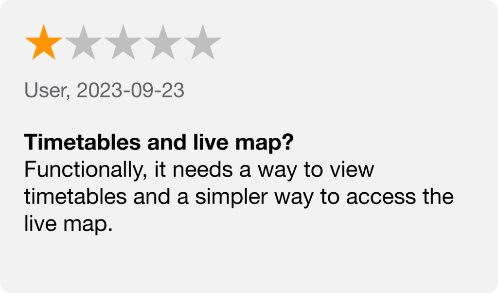
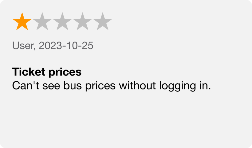
However, the feedback that locals and tourists have given after they have been using the app, has been largely negative. Users complain about its usability and overall experience. Locals are frustrated by technical glitches, while tourists struggle with the app’s lack of user-friendly features and guidance.
To gather user feedback, we review comments on both the App Store and Google Play Store, identifying common themes and specific issues.
Examples for the identified themes was difficulties with website navigation, technical issues, requests for new features and other general dissatisfactions. By doing this we could easier identifiy priority areas for improvement.
Testing
Internal testing was conducted to check the problems mentioned in user reviews. Additionally, we performed usability testing for further confirmation. Our users were given different tasks like searching for trips from point A to B, provide feedback on any missing features, and indicate which features they use most in other travel apps.
Target groups
Two groups were identified within our target audience – locals and tourists. These groups have different needs and preferences because of their backgrounds and reasons for using the transit service.
User stories & tasks
We used a Scrum board to plan our development process. We created user stories based on our research, which represented specific user needs or improvements. Examples of some user stories included – “As a user, I want to be able to track the location of the bus to plan my journey effectively,” and “As a user, I want to be able to view previous searches and save favorites to quickly find departures.”
These stories were then divided into tasks, outlining the steps needed to address the identified issues.
Style guide
A style guide was created, maintaining the existing brand identity of Gotlands Kollektivtrafik but making improvements for better visual appeal and user experience.
Wireframes / Mockups
Wireframes was created to explore different layout styles. When we had the right layout we followed up the design by creating mockups.
We conducted usability tests on our mockup and gained valuable insights into small changes that needed to be made and what needed to be added to the app. For example, users felt that the buy ticket-button should be larger, the live map needed to be redesigned to clarify buses and bus stops, and there were minor adjustments needed in the ticket menu.
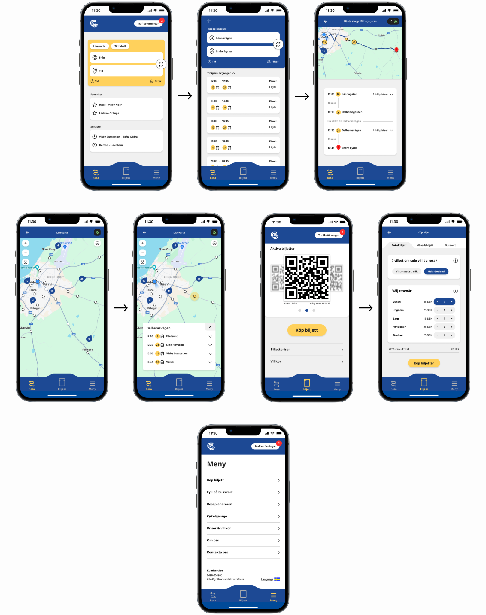
The final design
Results
The ticket menu has been redesigned to enhance user clarity. Prices and conditions are now clearly visible, and purchased tickets are conveniently saved as QR codes in the app, ensuring smoother boarding on the buses.
Traffic delays are now clearly visible across the journey, ticket, and menu views. Additionally, the introduction of ‘favorites’ and ‘recent searches’ aims to improve user experience by providing quicker access to frequently used features.
A button to get to the live map has been incorporated on the homepage, to give easier access for users.
By focusing on what users need and want, we made several improvements to the app. These changes were based on research and aimed to solve problems users were facing, making the app easier and more enjoyable to use for both locals and tourists.
We didn’t just fix specific issues – we also gave the entire app a makeover to make it look better and work smoother. Our goal was to make things simpler and easier to read and use.